Alongside the national CPI numbers, the Bureau of Labor Statistics publishes regional and metro-area price index levels. We take a look here at a few interesting data points from within the myriad of indexes which were updated by the BLS last Wednesday.
In the table below we show the CPI-U All Items, year-over-year inflation rates for all of the local indexes. A few metro areas report only bi-monthly. Not shown are a few other metro areas which are reported on a semi-annual basis.
| Regional Inflation. All items All Urban Consumers (CPI-U). Not Seasonally Adjusted. |
||||||
|---|---|---|---|---|---|---|
| Regions, Sizes & Metros | Year/Year Inflation Rate (%) | |||||
| Sep. 2012 |
Oct. 2012 |
July 2013 |
Aug. 2013 |
Sep. 2013 |
Oct. 2013 |
|
| U.S. city average | 2.0 | 2.2 | 2.0 | 1.5 | 1.2 | 1.0 |
| – Size Class A (more than 1,500,000) | 2.0 | 2.3 | 2.0 | 1.5 | 1.3 | 1.0 |
| – Size Class B/C (between 50,000 and 1,500,000) | 1.8 | 1.9 | 1.8 | 1.5 | 1.1 | 1.0 |
| – Size Class D (under 50,000) | 2.8 | 2.7 | 2.3 | 1.6 | 0.9 | 0.9 |
| Northeast urban | 1.7 | 1.9 | 1.8 | 1.5 | 1.1 | 0.7 |
| – Northeast urban – Size Class A | 1.7 | 1.8 | 2.0 | 1.5 | 1.3 | 0.9 |
| – Northeast urban – Size Class B/C | 1.7 | 1.9 | 1.2 | 1.3 | 0.6 | 0.2 |
| – New York-Northern New Jersey-Long Island, NY-NJ-CT-PA | 1.6 | 1.7 | 2.1 | 1.7 | 1.6 | 1.1 |
| – Philadelphia-Wilmington-Atlantic City, PA-NJ-DE-MD | – | 2.2 | – | 1.1 | – | 0.3 |
| – Boston-Brockton-Nashua, MA-NH-ME-CT | 1.7 | – | 1.9 | – | 1.0 | – |
| Midwest urban | 1.9 | 2.2 | 1.8 | 1.2 | 1.0 | 0.8 |
| – Midwest – Size Class A | 1.9 | 2.1 | 1.9 | 1.4 | 1.0 | 0.7 |
| – Midwest – Size Class B/C | 2.0 | 2.2 | 1.5 | 0.7 | 0.9 | 1.0 |
| – Chicago-Gary-Kenosha, IL-IN-WI | 1.6 | 1.7 | 1.7 | 1.1 | 0.7 | 0.5 |
| – Detroit-Ann Arbor-Flint, MI | – | 2.4 | – | 1.3 | – | 0.7 |
| – Cleveland-Akron, OH | 1.8 | – | 2.2 | – | 0.7 | – |
| – Midwest – Size Class D | 2.1 | 2.3 | 2.2 | 1.6 | 1.1 | 0.8 |
| South urban | 2.1 | 2.1 | 2.2 | 1.7 | 1.3 | 1.3 |
| – South – Size Class A | 2.2 | 2.2 | 2.2 | 1.7 | 1.3 | 1.4 |
| – South – Size Class B/C | 1.9 | 1.9 | 2.2 | 1.8 | 1.4 | 1.3 |
| – South – Size Class D | 3.3 | 2.7 | 2.3 | 1.4 | 0.3 | 0.5 |
| – Washington-Baltimore, DC-MD-VA-WV | 2.8 | – | 1.9 | – | 1.2 | – |
| – Dallas-Fort Worth, TX | 2.3 | – | 2.7 | – | 1.4 | – |
| – Houston-Galveston-Brazoria, TX | – | 1.4 | – | 2.3 | – | 1.8 |
| – Atlanta, GA | – | 1.8 | – | 1.5 | – | 1.6 |
| – Miami-Fort Lauderdale, FL | – | 2.0 | – | 0.6 | – | 0.9 |
| West urban | 2.2 | 2.5 | 1.9 | 1.5 | 1.3 | 0.9 |
| – West – Size Class A | 2.3 | 2.8 | 2.0 | 1.5 | 1.3 | 0.8 |
| – West – Size Class B/C | 1.5 | 1.6 | 1.6 | 1.6 | 1.2 | 0.8 |
| – Los Angeles-Riverside-Orange County, CA | 2.2 | 3.0 | 1.3 | 0.8 | 0.6 | -0.1 |
| – San Francisco-Oakland-San Jose, CA | – | 3.2 | – | 2.0 | – | 1.6 |
| – Seattle-Tacoma-Bremerton, WA | – | 2.3 | – | 1.1 | – | 0.6 |
Note on Size Classes from the BLS: “The A population size class represents all metropolitan areas over 1.5 million; B/C represents mid-sized and small metropolitan areas (fewer than 1.5 million); and D, all nonmetropolitan urban areas. Due to insufficient sample sizes, region-by-size indexes are not published for Northeast and West Size Class D.”
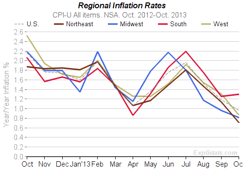
Click to enlarge
Notice how the South Urban index has risen by 1.3% over the past year, whereas the other three regions in the country have risen by less than the US average of 1.0%. The Northeast’s inflation rate, at 0.7% is nearly half that of the South.
Medium to small metro areas in the Northeast enjoyed an index rise of only 0.2% compared, again with 1.3% for those in the South.
The Houston-Gelveston-Brazoria metro area claims the top spot in terms of All Items inflation at 1.8%, closely followed by Atlanta and the San Francisco Bay Area at 1.6%.
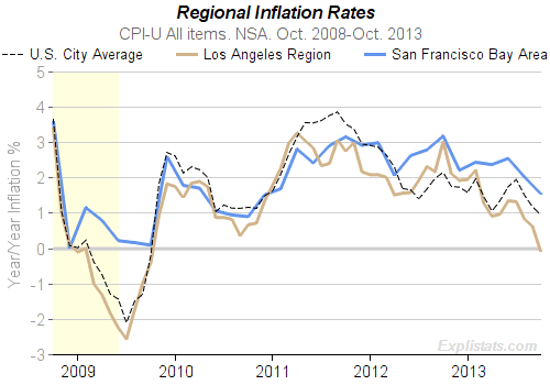
Click to enlarge
That last area contrasts markedly with the other main California metro-area: Los Angeles – Riverside – Orange County whose All Items index has dropped by 0.1% over the past twelve months.
The difference in weighting that gasoline has in the two areas will contribute to the 1.7% difference in inflation rates, but there are some eye-catching differences at the expenditure group level:
| Los Angeles, Riverside, Orange County | San Francisco, Oakland, San Jose | U.S Class Size A (Large Metro) Avg. | |
|---|---|---|---|
| Owners’ equivalent rent of primary residence. | 1.9% | 3.7% | 2.5% |
| Medical Care | 1.4% | 4.3% | 2.8% |
| Food (at home) | 1.4% | 1.5% | 0.7% |
| Food (away from home) | 0.8% | 4.1% | 0.6% |
A fuller table of the S.F. numbers can be found below. Forgive us this focus on the high price increases in the Bay Area. We live there.
If readers would like some data from another specific metro area with or without comparison to others, and at the All Items or a level below, feel free to ask in the comments section of this post, and we’ll get you a chart or a table from our system.
| San Francisco-Oakland-San Jose, CA All Urban Consumers (CPI-U). Not Seasonally Adjusted |
||||||
|---|---|---|---|---|---|---|
| Expenditure Group | Year/Year Inflation Rate (%) | |||||
| Sep. 2012 |
Oct. 2012 |
July 2013 |
Aug. 2013 |
Sep. 2013 |
Oct. 2013 |
|
| All Items | – | 3.2 | – | 2.0 | – | 1.6 |
| Food and Beverages | – | 2.8 | – | 2.2 | – | 2.6 |
| – Food | – | 2.8 | – | 2.4 | – | 2.6 |
| Housing | – | 3.4 | – | 3.3 | – | 3.5 |
| – Shelter | 3.4 | 3.2 | 3.7 | 3.7 | 4.0 | 3.8 |
| – Fuels and Utilities | – | 8.1 | – | 2.1 | – | 3.8 |
| – Household Furnishings and Operations | – | 1.3 | – | -0.0 | – | 1.2 |
| Apparel | – | 5.6 | – | 0.6 | – | -3.5 |
| Transportation | – | 6.0 | – | -0.1 | – | -3.3 |
| – Private Transportation | – | 6.8 | – | -1.3 | – | -4.5 |
| Medical Care | – | 1.9 | – | 3.9 | – | 4.3 |
| Recreation | – | 0.6 | – | -1.9 | – | -1.5 |
| Education and Communication | – | -0.3 | – | -0.1 | – | -0.1 |
| Other Goods and Services | – | 1.9 | – | 3.6 | – | 1.3 |
| Energy | 3.9 | 9.6 | 3.9 | -3.6 | -2.8 | -9.1 |
| All Items Less Food and Energy | – | 2.8 | – | 2.4 | – | 2.3 |
| All Items Less Shelter | – | 3.2 | – | 1.0 | – | 0.2 |
| All Items Less Medical Care | – | 3.3 | – | 1.9 | – | 1.4 |
| All Items Less Energy | – | 2.8 | – | 2.4 | – | 2.3 |
| Commodities | – | 3.6 | – | -0.1 | – | -1.6 |
| Commodities Less Food | – | 4.3 | – | -1.7 | – | -4.3 |
| Commodities Less Food and Beverages | – | 4.5 | – | -1.8 | – | -4.6 |
| Durables | – | 0.1 | – | -1.9 | – | -1.2 |
| Education and Communication Commodities | – | -12.4 | – | -4.4 | – | -6.9 |
| Education and Communication Services | – | 0.8 | – | 0.3 | – | 0.4 |
| Other Goods | – | 2.1 | – | 2.6 | – | -4.1 |
| Other Personal Services | – | 1.8 | – | 4.3 | – | 4.9 |
| Household Furnishings and Supplies | – | 0.3 | – | -2.2 | – | -0.8 |
| Nondurables | – | 4.6 | – | 0.4 | – | -1.7 |
| Nondurables Less Food | – | 6.5 | – | -1.6 | – | -5.8 |
| Nondurables Less Food and Beverages | – | 6.9 | – | -1.8 | – | -6.5 |
| Services | – | 2.9 | – | 3.2 | – | 3.3 |
| Services Less Rent of Shelter | – | 2.5 | – | 2.3 | – | 2.6 |
| Services Less Medical Care Services | – | 3.1 | – | 3.1 | – | 3.2 |
| Transportation Commodities Less Motor Fuel | – | 1.6 | – | -0.9 | – | -0.3 |