Data, Charts and Spreadsheets Excel Workbook Manual
Overview
Note: “TBI” stands for “To Be Implemented”
The chart editor interface consists of three main sections.
The Series Selection panel is displayed along the top of the page. This defines which series are present in the chart and how they are displayed.
- The Series Selection panel is displayed along the top of the page. This defines which series are present in the chart and how they are displayed.
- The Chart Features panel is displayed below and to the left (on a desktop display). This allows for chart-wide features like titles, size to be set. It also includes a “Save and Redraw” button.
- The Chart itself, which shows the latest version once the “Save and Redraw” button has been pressed.
There is also a link beneath the chart on the editor page: “Download Excel Workbook”. Clicking this will offer a download of a workbook containing the current data, series definitions and rudimentary rendition of the chart, in Excel. The Workbook can be configured to enable update of the data by automated download. More details in the Excel Workbook Manual.
Series Definitions
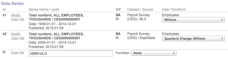
The screenshot below shows part of the Series Selection Panel. Each row shows either a data series or a “derivative” of one or more data-series.
Figure 1 (click to enlarge)
Click to enlarge
ID Labels.
Data-series are automatically given ID labels, “x1” etc. The numbers are system determined for uniqueness and have no effect on the display of the chart. These id’s can be referenced by any derivative series. Derivative series are assigned IDs beginning with “f”.
Series Name/Code
These are displayed in bold for each data series, along with the date range of data available, and the date the data was released.
[TBI – At present, the interface does not allow selection of release date from a menu, and instead will always default to the latest release]
Adj/Per
Shows whether or not the data is Seasonally Adjustmed (SA) or Not Seasonally Adjusted (NSA).
And, what the periodicity of the data is. In Figure 1, both series are Monthly.
Dataset / Source
Simply the name of the Dataset to which the series belongs, and the publisher of that Dataset.
Data Transform
Units are associated with each series, and these will be displayed together with a set of scalings and/or transforms such are period-to-period changes.
Derivative Formulas and functions
In a derivative series row, an input box is present, to the right of the Copy and Del links.
The box will accept and evaluate formulas which reference any other series, by Id.
A reference to an Id on its own means that the formulas value for any date in the series, uses the datum in the referenced series at that date. Date offsets can be referenced using number in brackets, or the special label, ‘start’.
Here are some example formulas:
| x2-x1 | The difference of two data series |
| 100*(x3/x2-1) | The excess of one series over another, expressed as a percentage |
| (x2[2] + x2[1] + x2[0])/3 | A three-period (lagging) moving average |
| 100*(x3-x3[start])/x1[start] | Percentage change in a ratio from the start the charting period |
| f1-f1[start] |
The change in another derivative series from the start(2) |
In addition, there are a few Functions which can be selected on a menu to the right.
We hope to expand both the functions which can be called within a formula (both acting on data e.g explicit moving average, and on the date, e.g. compound or linear growth), and in the drop-down menu.
Modify, Copy & Delete.
In the second column of shown in Fig. 1, the “Del” link for any series will remove (permanently) that series from the chart. (To hide rather than delete a series on a chart, see Display Options below).
The “Copy” link will create a clone of the relevant series. Note that the clone may appear with a lower of higher numerical ID.
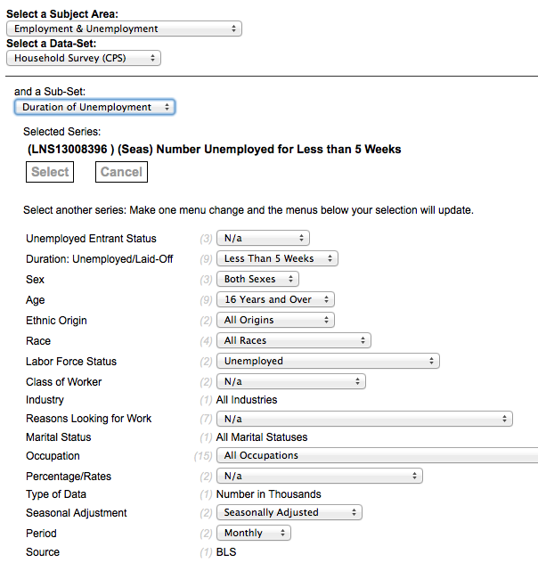
Modify
The “Modify” link will open a dialog box in which a new data series can be found and selected. There is no such link for a derivative series; Instead a formula input box (see below) is used.
An example dialog box is shown below.
The menus are the top-left, allow the selection of Subject Area then a Data-Set and, if available, a Sub-Set.
In this example we are looking at the Current Population or “Household” Survey of the U.S. Bureau of Labor Statistics.
The currently selected series is shown with its unique code and name.
The Select button returns the selected series to the chart and closes the dialog.
Note the larger set of menus below the selection. These are specific to each Data Sub-set and change dynamically as any menu is selected. The numbers in gray in parenthesis indicate how many items are available on a menu.
Figure 2 (click to enlarge)
Click to enlarge
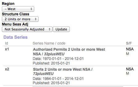
Super-Selector
Not yet available for set-up on the interface, some of our in-house charts make use of a feature which allows a Dataset attribute to be set across more than one data series in a chart at one time.
In Fig. 3 we show how three super-selectors can be used to traverse the Residential Construction Dataset (Census Department).
We have a chart set up to show two series, one of Permits and one of associated Housing Starts. The Dataset contains data on both for different regions of the U.S., different structure sizes, and in seasonally adjusted and no-adjusted forms.
Note that both of the data series are for the West Region, 2 Units or more, and NSA, as specified by the menu setting above. If we were to select South and Single Unit and then click “Update”, both series would change and the chart would update accordingly. Titles, subtitles and legend labels are also updated automatically.
Figure 3 (click to expand)
Click to enlarge
Series Display Options
On the right-hand side of the Series Selection Panel, the plotting of each series can be defined. A screenshot of an example section is shown below, in Fig. 4.
The check-box determines whether or not a series is plotted or hidden.
If plotted, you can select to plot as a line, bar or area. [BUG: Successful plotting of areas is highly dependent on color selection).
Two Y axes can be used, left and right and each series can be assigned to one or the other.
A label for the chart “legend” (if displayed) can be given. Using the text, $series_name will cause the full name of the series to be used as the label.
Figure 4 (Click to enlarge)
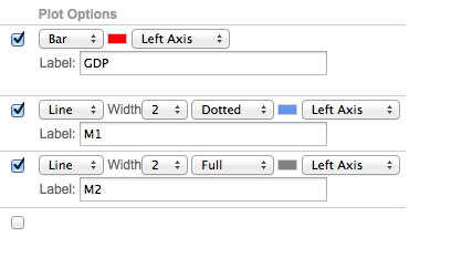
Click to enlarge
[TBI: The series are plotted sequentially in the reverse of order in which they are listed. Sometimes it is important for the plotting order to be set differently. At present this necessitates a shuffling sequence of Copy and Del to achieve the desired result. In future, plot order will be added as an explicit setting]
Chart Features Panel
A screen shot of an example chart features settings is shown in Fig. 5, with the resultant chart shown in Fig 6.
| Figure 5 (Click to enlarge) | Figure 6 (Click to enlarge) |
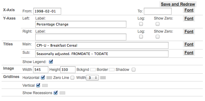 Click to enlarge |
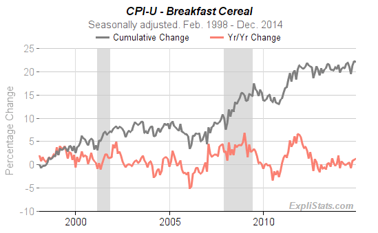 Click to enlarge |
Font settings for all labels are changed by clcking on the Font link and selecting color, size, bold/normal and italic/normal from the pop-up. The Update button on the pop-up must be clicked for your changes to take effect.
Figure 7

X-Axis
Dates need to be entered in YYYY-MM-DD format. For monthly, quarterly, annual periodicities set the day to ’01’. If left blank, the From date will default to the earliest date available, and similarly for the To date, the latest date available.
Y-Axes
Each axis, Left and Right can be given a label with its own font. The scale can be logarithmic or linear, and you can insist that the x-axis is set along the zero value of the (left) y-axis. (This may be needed in order to over-ride the inbuilt decision making on choosing the y-axis scales.)
Titles
A main and sub-title can be given, each with its own font. The Legend can be displayed or suppressed. The legend is shown underneath the tiles and labels each chart plot line, bar or area.
Image
Here you can specify the dimensions of the chart image, its background image and any border color. For a border-less look, set the border color to the same as that of the background. A shadow effect on the border can be switch
Gridlines
Horizontal and Vertical grid-lines can be switched off or on, and given a color.
A horizontal zero-line can be added to give emphasis when the x-axis is not aligned with zero on the y-axis.
U.S. Recessions can be shown as shaded background bars, with a choice of colors.